
As designers, we intuitively make decisions that affect how we communicate with our audience. Most designers don't even know why they have that gut feeling that a design is perfect, or that it just won't work (no matter how much the boss likes it). Design psychology is really at play in those moments. Once we fully understand what is happening, we can make conscious design decisions for the purpose of communicating a holistic message.
So what is it?
It is a starting point. The basic understanding of how a majority of humans react to certain colors, shapes, fonts, and movements gives us a place to start designing with the intention of communicating a specific message. Once we have that starting point, we can then look at the task in context and narrow down our designs before the client even gets to see anything.
It is not universal. The context in which we look at these principles are culture, audience preference, brand marketplace, and the unique brand voice. For instance, the color red has a completely different cultural meaning in China than it does in the United States.
It is emotion based. Contrary to how psychology works, where our thoughts create our emotions, when using design psychology techniques, we work backward from the the emotion to the thought we want to generate. For instance, if we want to generate a thought, "I want to purchase those shoes," we get to figure out what emotions would come from that thought. Then, we use color, shapes, fonts, and movement to trigger that emotion in the audience. In theory, that emotion associated with the kick-ass copy, script, and product imagery would increase the likelihood that we have generated that thought within the customer.
It is creatively agnostic. We use these same principles in branding, motion design, filmmaking. set design, fashion design, fine art, and pretty much anywhere visual communication is happening. Knowing these principles helps us communicate more efficiently.
It requires empathy. On the other side of every design is another human... just like us. It could be tempting to use these principles to control or manipulate people. However, when we practice empathy, by first feeling our designs as we make them, we can use this powerful tool to reinforce good messages.
Color
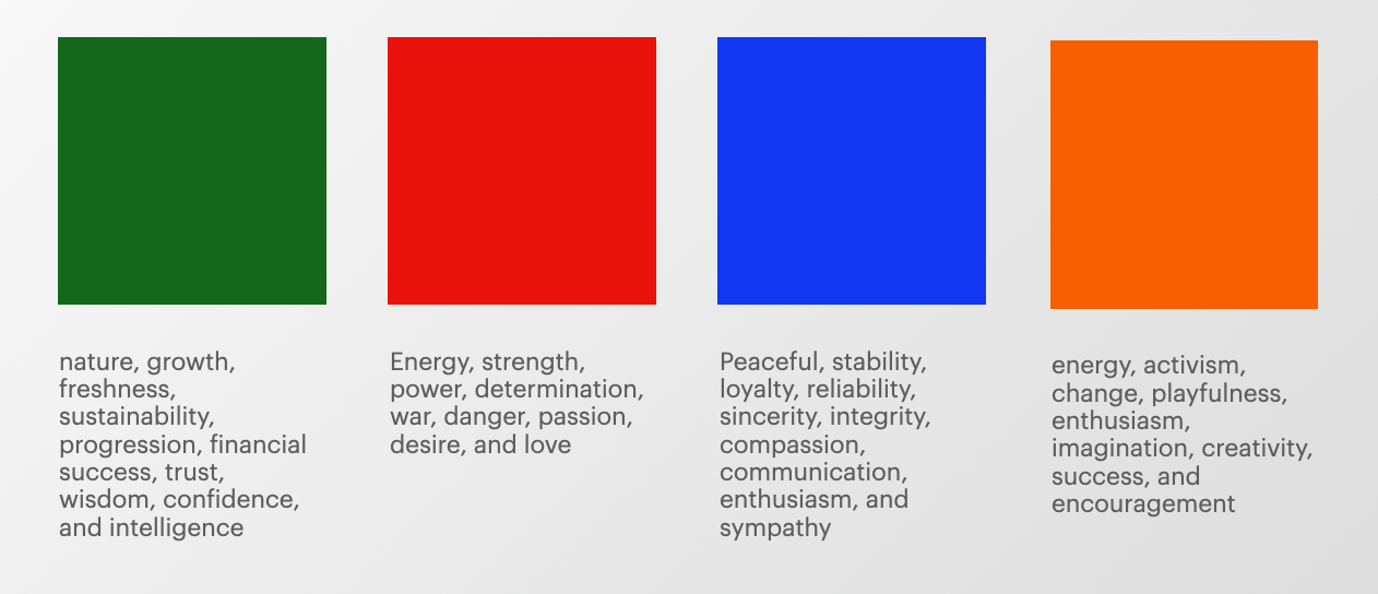
There is an entire spectrum of color, and believe it or not every shade (darker), tint (lighter), and level of saturation of every color has a slightly different meaning. For instance, the color red can trigger feelings of passion but a darker red is more of a romantic passion while a brighter, more saturated, red is more of a competitive passion. When we combine colors with various meanings, we create new meanings. For instance, blue triggers feelings of peace and calm. When we combine it with the energy and joy that yellow triggers, we start to feel the feeling of freshness and the energized peaceful feeling, similar to what we feel in nature, that green creates.
When we put this concept into practice, we get to look at the colors in context. For example, if we are building a brand visual identity for an Austin, TX based business that is targeting college aged sports fans, we need to view the brand through their eyes. If we build a brand visual identity that uses maroon, those UT Texas students will likely automatically associate that brand with Texas A&M, and that business just lost their local customer base.
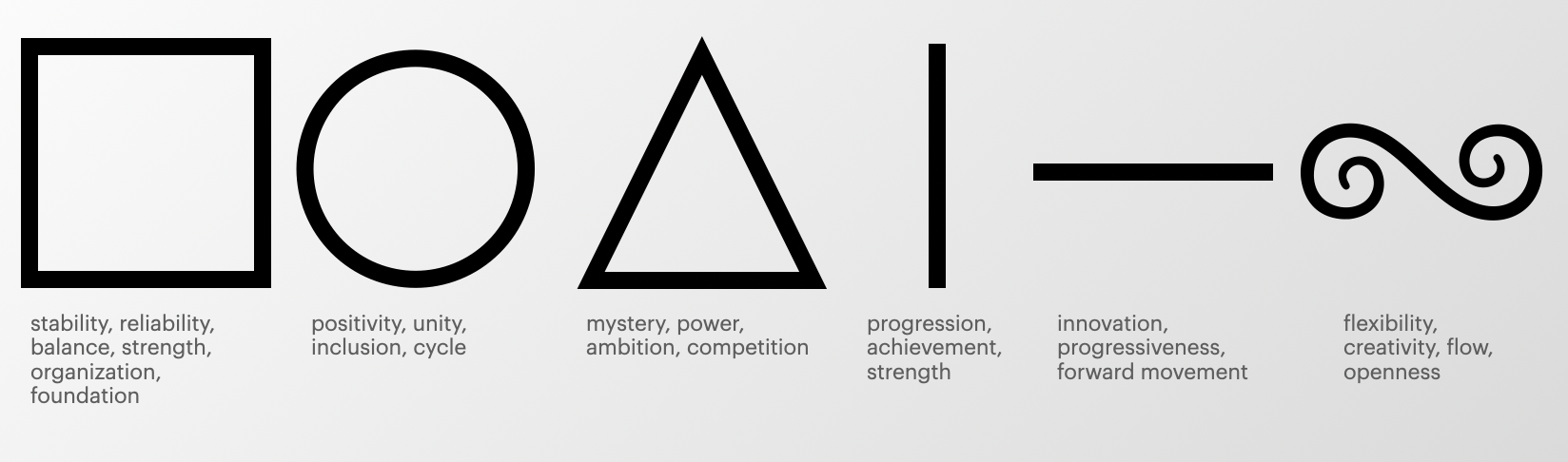
Shape
Whether building a logo, or designing a 3D environment, the shapes we use also trigger very specific feelings. The audience is unaware of the fact that it is happening, so often, when a business needs to re-brand, it is because the shapes used previously subconsciously conflict with the brand mission, vision, and values. For example, if an organization's values are anchored in inclusivity, inclusion, and creativity, but they are using triangles in design materials something happens in the consumer's brain called Cognitive Dissonance. Since the description of the organization and the visual design elements that represent the brand are out of alignment, the consumer immediately rejects the brand because their subconscious mind knows that there is something wrong.
Just like with color, we then take this into context of our audience. Different cultures use different shapes as symbols for various things. So we get to be very aware of what cultural messages we are sending as well.
Font
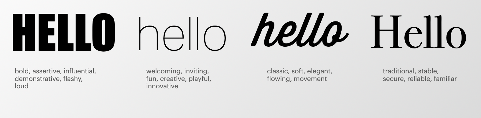
Choosing fonts for anything can sometimes feel like a battle of preference. However, when we use these principles, it becomes a conversation about personality. Because shapes make up fonts, we can use the same principles to start our font search. Do we want a warm, inviting, inclusive, and creative font? Then we can start to look at more rounded fonts, similar to using a circle to convey that same feeling. Personally, though, I think it is most powerful to imagine the font as a person entering a room. How does that person say, "hello?"
In practice, when we understand a brand's personality and voice, we can imagine how would that brand walk into a room and say hello? What clothes are they wearing? Do they speak, yell, sing, or whisper when they walk in the room? Once it is put into this context, we can literally start to hear the fonts speak to us.
Again, it is always important to put these principles into context. Some cultures have used certain fonts for so long that any personality is drowned out by visual associations with a product, service, or entity.
Conclusion
When starting out with these principles, listening to your intuition is the first place to start. After all, you are a human, talking to humans. So remember to use empathy and kindness throughout your work.